
Many brands over the years have converted their laborious names to an
acronym especially good when it’s time to refresh or restart and what a
prefect time as these times.
What is a brand first, a name, term, design, symbol, or any other feature that identifies one seller’s good and services from those other sellers? Especially in these times to distinguish your brand from others to by simplifying and easily communicated to distinguish one products, services, and concept in a creative fashion. Now what is an acronym, or an abbreviation is a shortening based on the principle of relevant sounds and letters. What better way to come out of post COVID with an identifiable, clean, simplistic way that will usually look modern and adapting to the forward thinking and fast-paced world we are in today. It’s a GREAT idea. Let me give you some examples of those top companies that have done many years ago and with good reason most because their names where to cumbersome and the abbreviated word is easy to remember, eye catching as a logo and just WAY cooler!
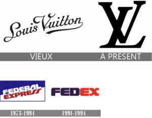
There is so much meaning behind these rebranding to abbreviations you can even subliminally insert hidden messages. Can you see the arrow in the FedEx Logo? Genius right, I love the subtilties in these concepts. There is meaning in every part of these logos even in the color palette chosen. For LV the bold font and letter represent the founder’s style and representation the long tradition, sophistication, and ultra-luxury.
Here are a few more:
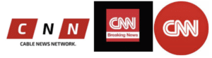
Where CNN was the Cable News Network to Cable New Channel turns to CNN:
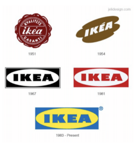
So, IKEA was always abbreviated to the founder’s name which is: I & K for Ingvar Kamprad, E & A represents Elmtaryd farm and Agunnaryd Village. The logo represents the founders love for his origins built right into his logo.
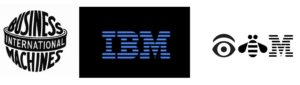
International Business Machines becomes IBM in 1947 the new logo became more modern and minimalist approach and still uses the blue. It is blue because of the calming effect that they will get the job done and the powerful font. Also, the 8 stripes cut in the font give a sense of power, influence, and a perfect reputation.
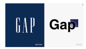
GAP was one company that really tried in 2010 to make a change and it did not work well with consumers. There was so much back lash on emails, letters, and social media that the company reverted just after one week.
Here you have a few ideas of what top companies have done themselves to rebrand and this in turn will keep the brand alive and on the top of minds to your clients and consumers. To adapt and change or create something new is part of the many facets of communication. Change can be a very positive and progressive marketing objective to do for your brand. Let us know if you have any other favorite logo abbreviations or rebranding.
Thank you and let’s get creative,
Patsy I. Linares


Recent Comments