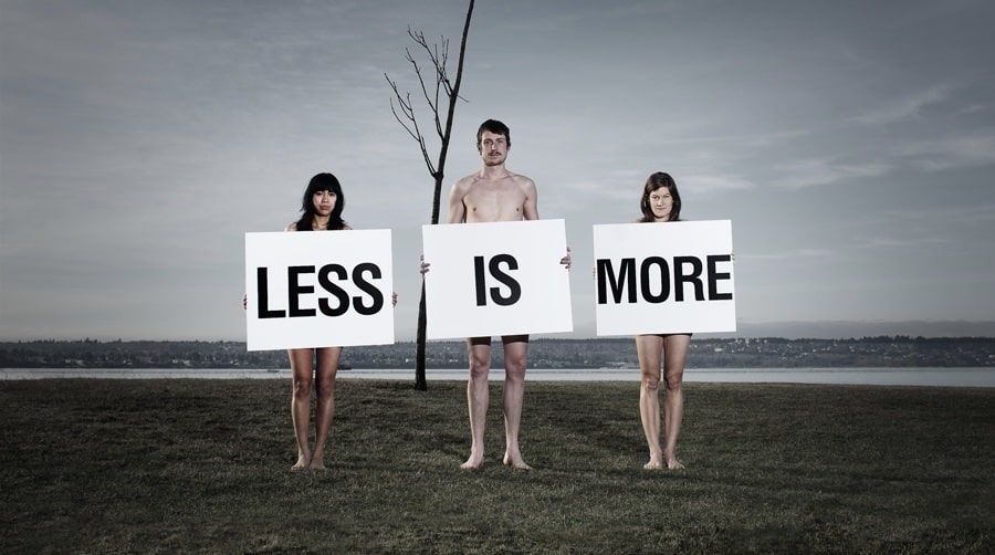
Less Is More
… we should all try to do more with less.
Less is More.
Is a well know saying by world famous German American minimalist designer and architect Ludwig Mies van der Rohe, which has been synonymous with the Bauhaus theory of design which he was a director of during his time. Also, a platitude of lifestyle, design theories, movements used in everything film, design, art, graphics, advertising and video today. We can almost use this AND more with less especially when it comes to marketing communication in which we try to Inform, Remind, Persuade, and Connect.
Ludwig Mies van der Rohe also said “It is better to be good than to be an original” and I truly believe when to comes to the creative work for my clients we strive for originality as best as we can. One area where we can achieve this as designers, marketers and communications is the POWER of effective emptiness and space in visual imagery.
Let It All Flow.
“Emptiness is an essential aspect of life.”* It is known in art and especially in advertising that a generous amount of white space does so much to the page. Drawing your eye with a visual flow from the headline to the main call to action to the company logo. It allows headlines to pop, body copy to be read, curiosity to having the viewer actively involved in the communication of the piece. Like paint on canvas filling an empty space is an art of its own. White space is the raw ingredient to start any creative project. However, designers do not just fill the emptiness, it is how we use that emptiness is the real art form.
The Emptiness Transends.
It now becomes white space, which is emptiness in a two-dimensional design, with so many different forms. It can become a positive, negative area, trapped, and intricately linked. White space can be activated when one single back line is removed or there is a desired solution for typography. White space can be framed with a frame of reference, it can also look deliberately used. The rules must be clear and used correctly for the use of too little white space results in the ad or spread looking like a mistake and that something may be missing.
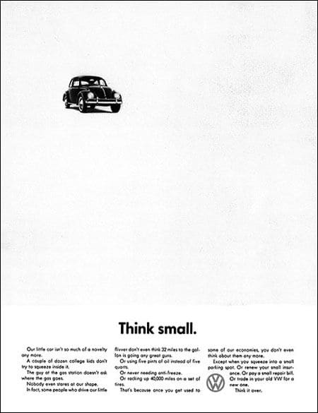
USE OF WHITE SPACE THAT HAS THE TYPE AND FIGURES OFF CENTER IT ACTIVATES THE SPACE
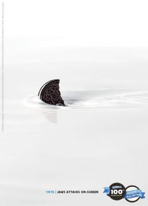
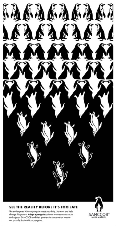
To Symmetry or to Asymmetry.
Creating an effective white space to combine everything from fonts, images, graphics, illustrations is like conducting an orchestra. Many of the ways that might be done is by taking the space as a shape where, we as creatives, arrange the shapes for a purpose to especially persuade you and draw you in. Symmetry is where space is passive and all nicely centered then there is Asymmetry where its more active. It can have fonts and image on the sides or a possible pattern to make it dynamic as well. White space can also represent a design as clean or hideous, smooth and glossy or grungy. Ideas that space can signify is Quality (class, wealth), Solitude (Loneliness), Clean, Purity, Heaven, Abundance, Openness, Calmness and Ice.
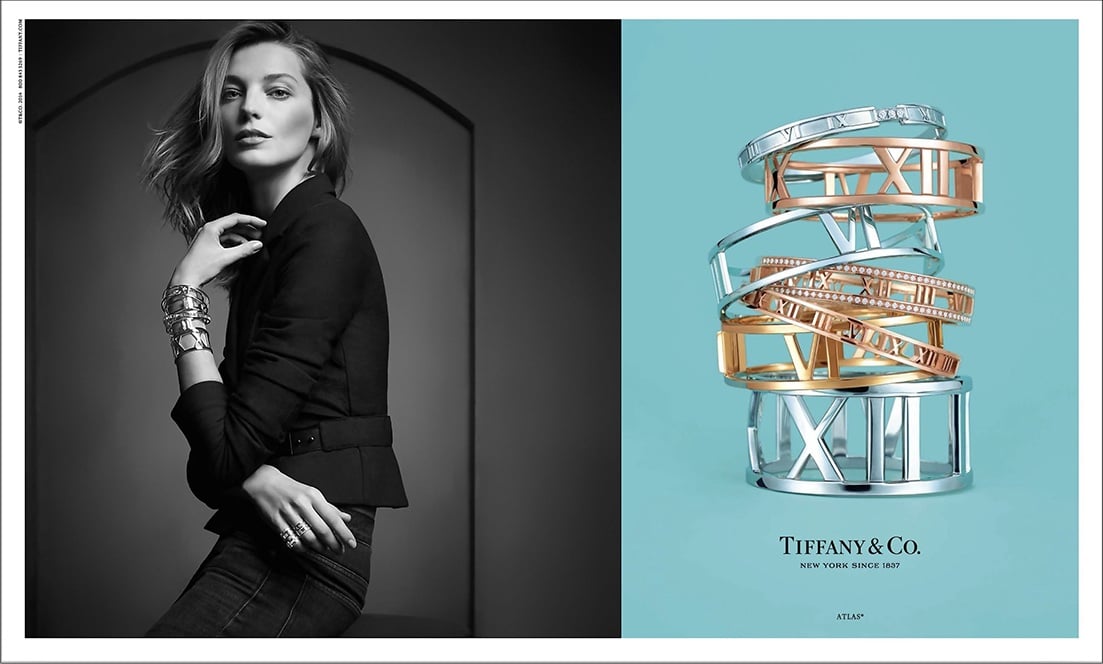
CENTERING A FIGURE NEATRALIZES EACH SPACE YET ASYMMETRICAL EACH IMAGE ON THE OPPOSITE SIDE CREATES EXCITIMENT ALMOST A SENSE OF TENSION. WITH A DASH OF QUALITY AND WEALTH BY THE USE OF COLORS AND IMAGERY. USE OF BOARDER. THE FRAMED IMAGE ACTS AS A WINDOW AND IT DOES EXUDE QUALITY
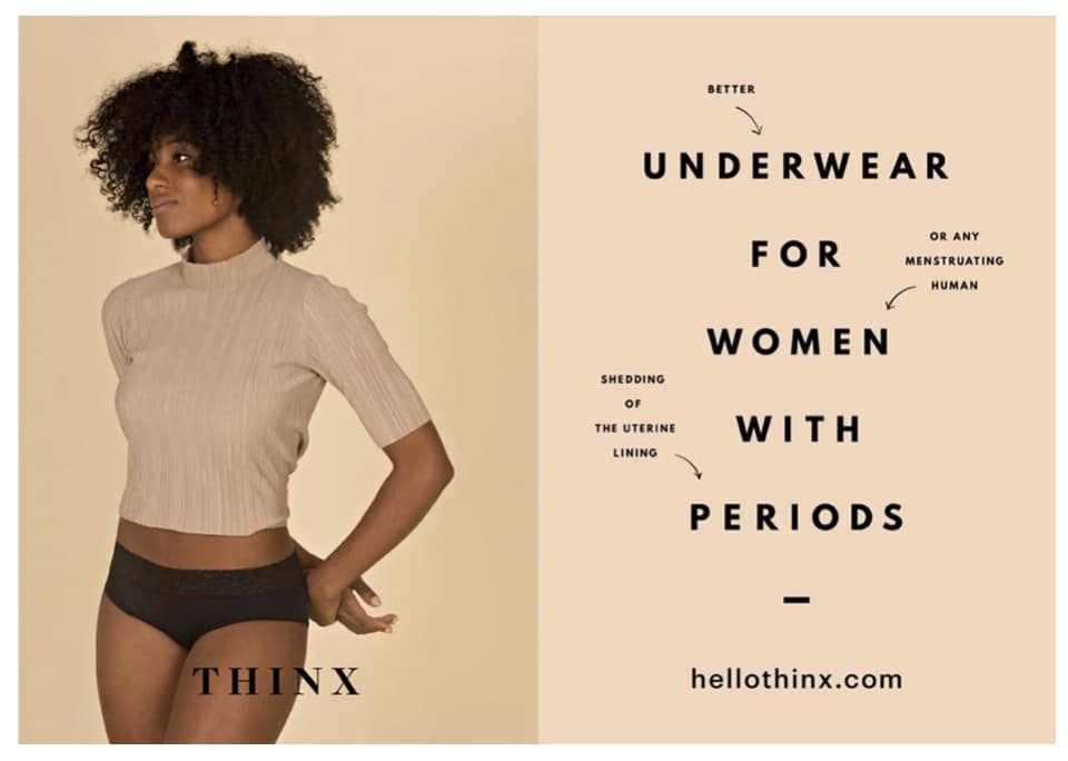
THE FEELING OF CLEAN, PURITY, CALMNESS WHICH BE SIGNIFIED WITH THE ASYMMETRICAL IMAGES GIVE THE RIGHT NUMBER OF DYNAMICS.
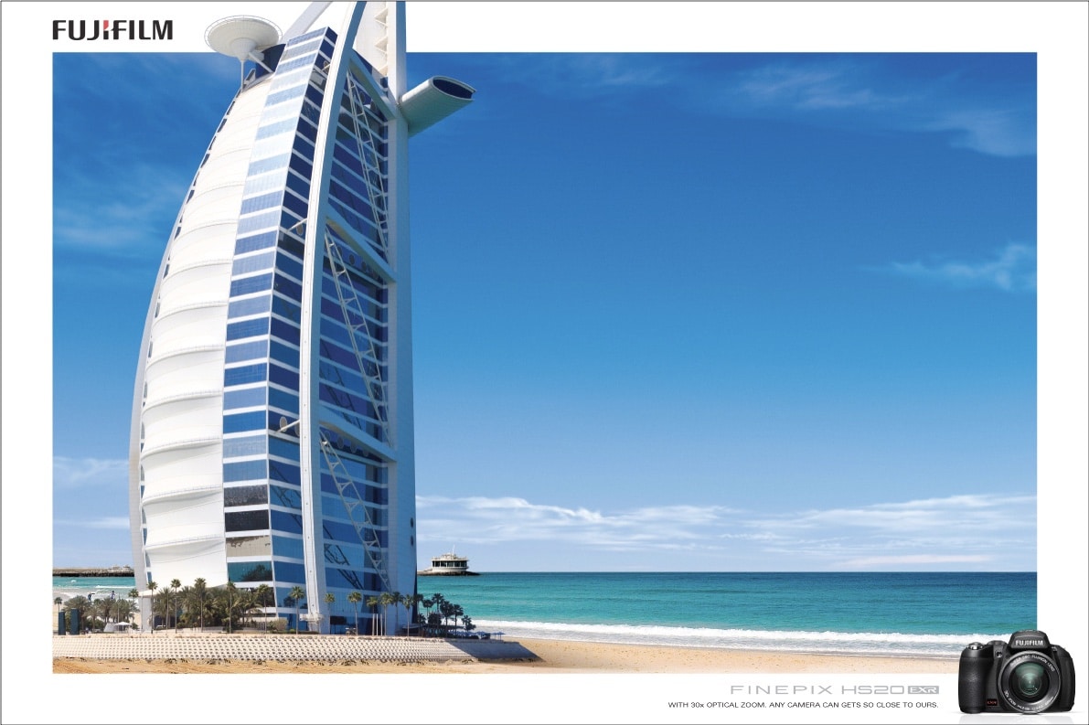
MY THOUGHT IS THE LARGE HOTEL VS THE SMALL CAMERA IS GREAT WAY TO INCREASE THE VISUAL CHARISMA AND ENERGY OF A COMPOSITION. IT IS GREAT IT IS NOT CENTERED, AND THEY ARE JUXTAPOSITION TO CREATE ENERGY AND DYNAMISM WHICH IS INCREASED WHEN ONE SIDE MORE OPEN THAN THE OTHER. THE AD I BELIEVE SIGNIFIES QUALITY, PURITY AND IT IS HEAVENLY!
In The End
I wonder how you feel now about “Less is More” or is it how do you create more with less. As an agency that has worked with travel brands for years that is what we try to create- award winning design creating MORE. Meaning more information about the brand, more brand essence, and more brand meaning with less. There is little white space ratio, the client wants you to say everything in one ad, they just spent a huge budget on a fabulous photoshoot in Europe and a huge media buy that will transcend to all touch points. Therein lies the goal of the designer, marketer or writer create more with less and still Inform, Remind, Persuade, Connect = Amazing Brands!
Thank you and let’s get creative,
Patsy I. Linares
*The Elements of Graphic Design 2nd Edition by Alex W. White


Recent Comments